Brand Story
Settle where you belong. Seek in the pages. Spark what only you can imagine.
Spark – Imaginations Set Free
And then, something happens. A moment of insight, a feeling of wonder, a thread of inspiration. What began as quiet curiosity becomes a spark. You leave changed—braver, wiser, or more creative than before. That’s what libraries do best: they don’t just offer information. They spark what only you can imagine.
Settle - A Place to Belong
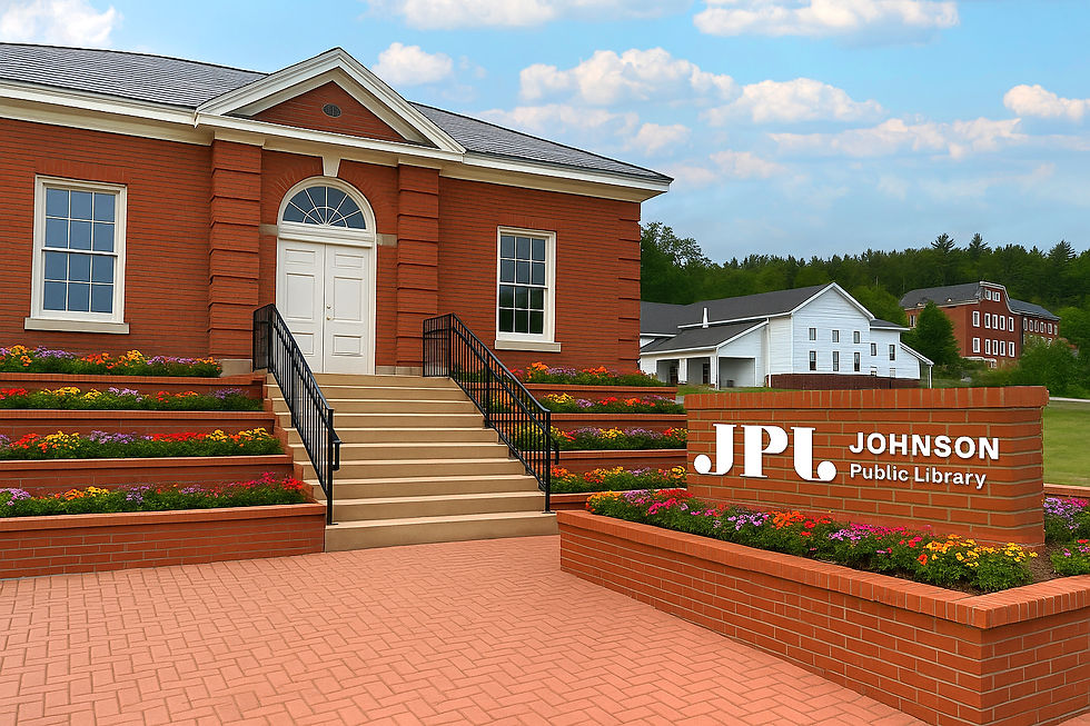
Since 1909, the Johnson Public Library has been a cornerstone of comfort and connection. For over a century, it has welcomed readers, learners, and dreamers into a warm, accepting space—free of judgment and full of possibility. Even as floods threatened its foundation, the library endured. In 2025, the entire building was relocated out of the floodplain—preserving its past while embracing a new chapter. Johnson’s library remains a safe, steady place to settle where you belong.
Seek – Pages of Possibilities
Beyond its cozy walls lies a gateway to discovery. With books, resources, programs, and technology, the library invites you to seek in the pages—to explore new worlds, ask questions, and stretch your mind. Whether you’re researching, imagining, or simply flipping through something new, the library holds knowledge that’s waiting to be shared with anyone curious enough to reach
for it.
Mood Board
Clean & Cultivated
Selected by the Johnson Public Library trustees, the Clean & Cultivated mood board blends classic book design with contemporary clarity. Inspired by mid-century Penguin and Puffin covers from the 1960s–70s, it combines graphic shapes, poppy primary colors, and elegant serif typography marked by bold contrast in stroke weights. These nods to vintage publishing give the identity a literary backbone—historical, but never old-fashioned.
Playfulness is introduced through sparing use of
spot illustrations with thin linework and hand-colored forms, evoking a printmaking spirit. Paper textures soften the structure, while generous white space and human-centered typography keep the design open and accessible—like a well-organized shelf that invites exploration.


Primary Logo
The primary logo for the Johnson Public Library should be used as the central visual element in all official branding, ensuring it maintains clarity, legibility, and balance. Always use the logo at a size where all elements, including text, remain readable—preferably on neutral or lightly textured backgrounds to preserve contrast. The logo should only appear in its designated brand colors or in solid black or white when color isn’t possible. Do not stretch, skew, rotate, or apply effects like drop shadows or gradients. Do not place the logo over busy imagery or colors that reduce visibility. Maintain clear space around the logo equal to the height of the “J” in the mark to prevent crowding. Use the primary logo consistently across digital platforms, print materials, and signage to reinforce the library’s identity.
Logo Mark
The logo mark is the JPL monogram enclosed in a red circle with cream-colored letters. It represents a bold, simplified version of the library’s identity and is intended for use in social media icons, stamps, merchandise, and other small-format applications where full text isn’t necessary. The mark should not be altered or recolored and should always retain strong contrast to remain easily recognizable.


Horizontal Logo
The horizontal logo for Johnson Public Library features a horizontal layout, designed for use in narrow spaces such as website headers, letterheads, or signage where the primary logo’s full layout may not fit. It maintains the same typography and color standards as the primary logo, ensuring brand consistency while offering flexibility. Always use it in its original proportions and colors, and avoid placing it on busy or low-contrast backgrounds.

Brand Elements


Typography
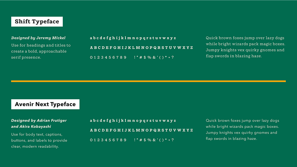
Typography in the Johnson Public Library brand reflects the balance between comfort, curiosity, and transformation. Like the library itself, the type system is designed to feel welcoming and grounded while leaving space for imagination. The serif typeface brings a sense of history and quiet structure, connecting to the library’s long-standing role as a cornerstone of community and learning.
Paired with a clean, modern sans-serif, the type system ensures clarity, readability, and accessibility across all platforms—from printed materials to digital experiences. Whether settling into a familiar story or seeking out new knowledge, the typography supports the brand’s message: Settle where you belong. Seek in the pages. Spark what only you can imagine.

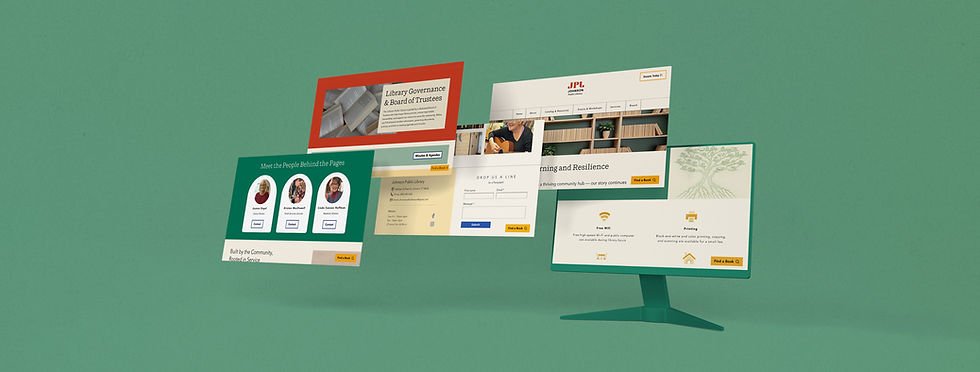
View Live Site:
